
User Flow visualisations with BigQuery and R
The in Google Analytics is there to help cast light on how users are flowing through and exiting a website. However, the options to tweak the level of detail and site sections are limited, which can prevent an analyst from reaching their desired level of insight about user behaviour.
Using the networkd3 package by and the bigQueryR package by , we can create a fully customisable and interactive network diagram and sankey chart of visitor flows.
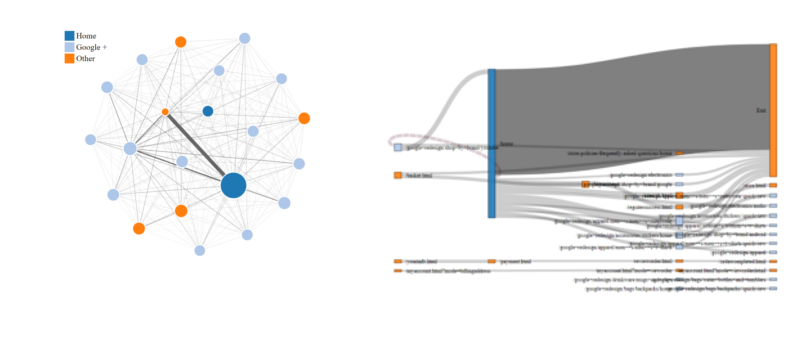
The resulting Network and Sankey visualisations
We’ll be able to specify:
- the total number of links to display between pages
- the total number of pages displayed
- session filters based on the page visited and referring campaign / medium.
What you need to make this work
The full list of packages used is bigQueryR, stringr, tidyverse, and networkD3. You also need a . This is needed to extract your pageflow data from BigQuery -> Google Cloud Storage, so you can extract it to R.
Once you’ve installed the necessary packages, you can clone the demonstration files from the Github repo. This should enable you to recreate the example shown below - just open an R project and use the example-pageflow.R script in the root of the repo.
Spare me the detail…
If you prefer to jump right into getting things working, rather than get the background on the BigQuery statement, you might want to skip straight through to the section on running the example query.
Getting the data from BigQuery
To create our visualisations, we need to retrieve each unique page viewed by our visitors, in order. The code below demonstrates how we do this on the public .
    SELECT *,
    LEAD(timestamp,1) OVER (PARTITION BY fullVisitorId, visitID order by timestamp) - timestamp  AS page_duration,
    LEAD(pagePath,1) OVER (PARTITION BY fullVisitorId, visitID order by timestamp) AS next_page,
    TIMESTAMP_SECONDS(CAST(timestamp AS INT64)) visit_timestamp,
    RANK() OVER (PARTITION BY fullVisitorId, visitID order by timestamp) AS step_number
    FROM(
    SELECT
        pages.fullVisitorID,
        pages.visitID,
        pages.visitNumber,
        pages.pagePath,
        visitors.campaign,
        MIN(pages.timestamp) timestamp

    FROM (
    -- First part - list of visitorIDs and visitIDs
    -- matching our date ranges & page/campaign/medium filters
        SELECT
        fullVisitorId,
        visitId,
        trafficSource.campaign campaign
        FROM
        `bigquery-public-data:google_analytics_sample.ga_sessions_*`,
        UNNEST(hits) as hits
        WHERE
        _TABLE_SUFFIX BETWEEN '{{date_from}}' AND '{{date_to}}'
        AND
        hits.type='PAGE'

        {{page_filter}}
        {{campaign_filter}}
        {{medium_filter}}
        ) AS visitors

    JOIN(
    -- Second part - list of visitorIDs and visitIDs
    -- matching our date ranges & page/campaign/medium filters
        SELECT
        fullVisitorId,
        visitId,
        visitNumber,
        visitStartTime + hits.time/1000 AS TimeStamp,
        hits.page.pagePath AS pagePath
        FROM
        `bigquery-public-data:google_analytics_sample.ga_sessions_*`,
        UNNEST(hits) as hits
        WHERE
        _TABLE_SUFFIX BETWEEN '{{date_from}}' AND '{{date_to}}' ) as pages

    ON
      visitors.fullVisitorID = pages.fullVisitorID
      AND visitors.visitID = pages.visitID

    GROUP BY
    pages.fullVisitorID, visitors.campaign, pages.visitID, pages.visitNumber, pages.pagePath
    ORDER BY
    pages.fullVisitorID, pages.visitID, pages.visitNumber, timestamp)
    ORDER BY fullVisitorId, step_number
The query gives us a nice, tidy table containing the page paths, next page visited (needed for later) and the step number of each page. (An example of the query output is shown later in this article)
Querying your own data
If you want to use this code on your own BigQuery tables, you must edit the sql/pagepaths.sql file. Replace the table references to the GA sample dataset with the table references for your own GA data. You can find these references in lines 21 & 41 of the sql/pagepaths.sql file.
Customising get_pageflow() parameters
You might have spotted that this query contains several placeholder values, surrounded by {{curly braces}}. These values are replaced with user-defined values by the get_pageflow() function. Here are the options you can play with:
-
page_filter: A Regular expression to filter out a page which must have been part of the users’ visits. This page could have been visited during any stage of their session (entry, exit and between). Leave as
NULLto include all visits. -
campaign_filter: A regular expression to filter out only sessions which, on referral, included a
utm_campaignparameter which matches the regex provided. -
medium_filter: Yep, a regular expression to filter out only sessions which, on referral, included a
utm_mediumparameter which matches the regex provided. - date_from: The earliest date for which you’d like to include sessions to the site.
- date_to: The latest date for which you’d like to include sessions to the site.
-
bq_project: The Google Cloud project name into which you’ll store your query results. Because the results of our initial query of the GA data can be very large, we temporarily store the results in a BigQuery table, then use
bqr_extract_data()to move this data into Google Cloud Storage, then read it into R. Don’t worry, this all happens in the background of theget_pageflow()function. - bq_dataset: The name of the BigQuery dataset in which you’ll temporarily store the pageflow query results.
- bq_table: The name of the BigQuery table in which you’ll temporarily store the pageflow query results.
-
gcs_bucket: The name of the Google Cloud Storage Bucket into which you’ll extract your
bq_tablerows into. -
delete_storage: If
TRUE, the storage object will be deleted from Google Cloud Storage once it has been read back into R, to save you some pennies. - service_key: The path to your API service key, which allows you to authenticate to the Google Cloud APIs. Please read the from Mark Edmondson if you need to get a service key. Make sure that this service account has full access to your BigQuery datasets and to your Cloud Storage buckets.
The bq_dataset, bq_table and gcs_bucket must all have been created in BigQuery / GCS before the function runs, otherwise it will fail.
Running the example query
In the example code, we will use the get_pageflow() function to query the sample dataset from 1 - 15 January 2017, filtering to visitors who passed through the /home page at some point in their journey.
When running this function in your own environment, remember to provide your own project, dataset, table, gcs bucket and service key in order for everything to work for you.
pageflow_data <- get_pageflow(
  page_filter = "\\/home",
  date_from = "2017-01-01",
  date_to = "2017-01-15",
  bq_project = "my-lovely-project",
  bq_dataset = "pageflows",
  bq_table = "pageflows_example",
  gcs_bucket = "pageflows",
  delete_storage = TRUE,
  service_key = "~/auth/get-your-own-key.json")
When you execute this function, you should see a few notifications to let you know that the BigQuery job is running, then being transferred to GCS and finally read in to R.
Here are the columns you should expect in your results:
##         fullVisitorID    visitID visitNumber
## 1 000061389728385731           1
## 2 000061389728385731           1
## 3 000061389728385731           1
## 4 000061389728385731           1
## 5 000061389728385731           1
##                                       pagePath  campaign  timestamp
## 1                                      /home-2 (not set) 1483595731
## 2         /google+redesign/bags/backpacks/home (not set) 1483595739
## 3     /google+redesign/drinkware/mugs+and+cups (not set) 1483595757
## 4      /google+redesign/accessories/housewares (not set) 1483595795
## 5 /google+redesign/apparel/kid+s/kid+s+toddler (not set) 1483595809
##   page_duration                                    next_page
## 1         7.609         /google+redesign/bags/backpacks/home
## 2        18.336     /google+redesign/drinkware/mugs+and+cups
## 3        38.191      /google+redesign/accessories/housewares
## 4        13.606 /google+redesign/apparel/kid+s/kid+s+toddler
## 5            NA
##           visit_timestamp step_number     job_cost
## 1 2017-01-05 05:55:31 UTC           1 3.923973e-05
## 2 2017-01-05 05:55:39 UTC           2 3.923973e-05
## 3 2017-01-05 05:55:57 UTC           3 3.923973e-05
## 4 2017-01-05 05:56:35 UTC           4 3.923973e-05
## 5 2017-01-05 05:56:49 UTC           5 3.923973e-05
Visualising the journeys
From here, it’s a simple case of calling the chart_network() function to generate our charts.
This is a wrapper function for forceNetwork() from networkD3 package, which does all the heavy lifting.
First vis - Network diagram
We build an example network diagram using our pageflow data:
chart_network <- network_graph(page_table = pageflow_data,
                        type = "network",
                         n_pages = 20,
                         net_height = 800,
                         net_width = 1200,
                         net_charge = -300,
                         net_font_size = 12)
Here are the parameters we can set:
-
page_table: the name of the dataframe containing our page paths. In this case, the
pageflow_dataDF which we just read in from BigQuery. - type: one of ‘network’ or ‘sankey’.
-
n_pages: how many pages should be included in the diagram?
(Thetop_n()function is used withinnetwork_graph()to filter out pages, ranked in order of pageviews.) - net_height: the pixel height of the resulting network diagram.
- net_width: the pixel width of the diagram.
- net_charge: numeric value indicating either the strength of the node repulsion (negative value) or attraction (positive value).
- net_font_size: the font size of any labels.
This gives us a D3-generated network graph - best viewed on desktop, as you will see page name and pageview count on mouseover. The line widths are dictated by the number of users passing between pages.
I find this network graph useful to get a high-level feel of the ‘universe’ of pages being visited. Plus, the shiny beauty of the D3 object is enormous fun to play with.
Click the image above to view the interactive version.
Second vis - Sankey Chart
I find that the Sankey Chart presents user paths in a more easy-to-understand way than the network diagram.
We build our example chart using the network_graph() function, again:
chart_sank <- network_graph(page_table = pageflow_data,
                            type = "sankey",
                            n_pages = 35,
                            sank_links = 35)
We have a similar set of parameters to define:
-
page_table: the name of the dataframe containing our page paths. We use the same
pageflow_dataDF. - type: as above, the chart type - this time, ‘sankey’.
-
n_pages: how many pages should be included in the diagram.
(Thetop_n()function is used withinnetwork_graph()to filter out pages, ranked in order of pageviews.) - sank_links: How many link paths should be displayed? Play around with this number, higher values result in psychedelic spaghetti.
- sank_height: the pixel height of the output
- sank_width: the pixel width of the output
- sank_padding: how much padding should there be between nodes?
This chart gives us a representation of how users are flowing through the website. Click the image above to view the interactive version.
Enormous caveats
It’s important to note some major differences between the true nature of all user journeys and what the charts will represent:
- The number of pages displayed has been filtered, to make the graphic (arguably) legible. In doing this, we’ve removed some user journeys.
- The number of links between pages has also been filtered down - i.e. we only show the top n most popular paths. We do this by ranking the page links by how many users pass from one page to another, then filtering to the top n links by number of users. An accurate visualisation of all unfiltered links is likely to resemble the aforementioned psychedelic spaghetti.
Going further
Having created this basic output, there are some helpful next steps which can help to enhance our understanding.
For example - by defining more comprehensive page categories, to classify each URL in a way which is meaningful for the business. This can be achieved by creating a lookup table of regular expressions and categories, which can be appended on to our pageflow data frame using the fuzzyjoin package.
Once you have this page classification table, you can:
- Colour-code the objects in each graphic according to their section, giving you an understanding of the greater / lesser frequented areas of the site.
- Visualise how visitors move from section to section, instead of from page to page.
For now, however, I hope you find the approach and resulting graphics a useful way of visualising and examining user flows through your website.